Posts

Showing posts from January, 2023

Milanote Research Ideas for My Advirtising Project

Image
I have created my Milanote board, which helps me with my project 'Phycological influence of Advertisement' . I’m going to attach all the online materials and ideas that I’m going to use to write a project.Since I already found certain resources, I put them on the board and realized that I could look at the subject of my project from different sides.  I found a lot of articles from the journal Britannica, and I’ve also attached some of the titles to the books I’m going to be studying to know more about topic.     My Milanote Board

SMART Objective: Psychological Influence of Advertisement

Image
 SMART Objective: Psychological Influence of Advertisement 1970 Chrysler Imperial Advertisement Newsweek May 11 In my first project this term I will be creating an article, putting there different images as an example and proves. The main idea of my article is to illustrate how psychology influence on people while watching and reading advertisement(ad). I want to find answer on question ''Why psychologies are involved in the creating of advertisement and why people spend so much time and money on the creating of the ad?'' I will use different articles/interviews of preferably scientists and people who are success in the advertising career. In addition,I am going to use resources from the Kimberlin Library.  I will complete this and upload to a gallery on my website by the beginning of the beginning of the March.

My result with reflection

Image
This is my final result of advertisement.  My advertisement   Reflection:   I really like my result because I worked on it at least few hours. I did mistake in the world 'choise'. However, it is can be as a hook for people to open the link and found out who did this. In addition, I got feedback from my tutor and now I know that it is mistake to underline words. My advertisement do its work and for me it is success. 

Final Advert Creation

Image
 Today I did my advertising and in this post I will talk about the full process of its creation and show the end result.  First of all, I found a photograph, which will be my background, and which fits my theme and idea. To avoid the problems of plagiarism, I chose a picture from the site where it is allowed to download and use images. My main photo was taken from Unsplash . I also uploaded the logo to my computer. In order to edit the photo and create the advertising itself I used a site called Pixlr . I opened it and then push ''Start a design project''. After that, I chose an image to edit. Pixlr Opened image My next step was to add and edit the main text and slogan. Since I wanted people to pay attention to the photograph first, I made the text not too bright. However, I did a fill that matches to the background.  Text Settings  The photos above show the settings I applied to the two texts. I used font ''Georgia'', because it shows the seriousness of

Logo Creation

Image
  For my future advertising one of the main elements is the logo. I have already created my logo, so in this post I will tell you how to do it by yourself. First of all, I thought about the name of the organization I’m going to promote. To do this, I thought about the main task of advertising, its meaning. My organization is called No.Garbage.Org , so I’ve decided that I’m going to write the whole name of my organization in the logo. Since my organization is concerned with protecting the land and the environment, I used the circle to create my logo. After I finished thinking about my logo, I decided to start creating it. I was helped by a website called BrandCrowd .   BrandCrowd After opening the site, I entered the name of my company to form my logo.  After I entered my website data, I generated various ideas for the logo, with the theme I chose. From a lot of different logo, I chose the one I liked the most. It was also in different colors and I chose the one that best matches the b

Initial Plan for Advertisement

Image
 Since I decided to create my own advertisement(ad), I drew a row sketch on a piece of paper using just a pencil. Promotional sketch As you can see in the bottom right corner, I put the text and the slogan. I decided that the slogan would be a little lower and smaller than the regular text, because I want to draw the audience’s attention with text. The strokes that are shown on the text show the placement of the basic layout. To be more precise, instead of the stroke will be placed garbage. In the lower left corner, I put a logo that I will create in the next post. 

Creating an Advertisement: Ideas and Initial Research

Image
In the last lesson we discussed the topic of advertising(ad) and how it can affect a person. ''Good advertising is a dialogue with people'' (Lee Clow). I agree with this statement, as it reveals the working principle of advertising. People sell things through dialogue with customers. The more informative and addictive the dialogue, the more likely it is to succeed. Since I have been actively involved in helping the environment and raising environmental issues in recent years, I would like to share with you my research and analysis on advertising related to this topic. Bank of the Planet: Garbage Advertising Agency: Neogama/BBH, São Paulo, Brazil This photo is an advertisement of the Bank of the Planet . This organization has many advertisements aimed at environmental protection. Even though they are different, they are also united, as can be understood by some similarities. In all advertisements of this company in the foreground is the globe, but it can be modified de

Result of ''Silence''

Image
In the previous post I showed the whole process of creating my own series of sequential photos. In it I would like to show you the end result, as well as to tell you what the meaning is behind this series of images.  The main message I want to convey is that 'Silence is killing'. These pictures have a story and it’s that the main character once said nothing, which was bad for another person’s life. Now she is in the same situation. Silence affects not only someone else, but you as a whole. Reflection:  I liked my end result. However, I think I could achieve better results if I could work with light and camera settings. Also I should have spent more time on the background and work with processing. However, I am generally satisfied with my series of photos. They convey the meaning I put in them.

My Sequential Photography: Silence

Image
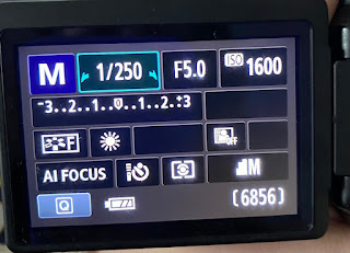
 In my previous posts, I told about sequential photography and how to make it by yourself. Also, I showed my collaboration with Roxy . In this post I would like to tell you how I did it by myself with the help of photocamera and applications like Photoshop and Lightroom.  The first thing I did was work on the composition in the frame. To make a suitable background, I took my sheet and hung it on my closet by attaching the ends of the fabric behind the handles of the closet with my hair bands. I also brought my portable easel, brushes, paints and paint palette. Since I don’t have a tripod, I put a table in front of me then I put a lot of books on it to get the right angle.  My next step was to set up the camera. All the photos you’ll see below were taken by Photocamera Canon EOS 600D. I set the aperture to 5.0 to start with, the ISO to 1600. Since I had a pretty bright natural light source, I didn’t use any extra lighting. My Settings on the camera When all the photos were taken, I de

Duane Michals as a Sequential Photographer

Image
In this post I would like to tell you about one of the famous sequential photographers whose work inspired me to create my own sequential images that you will see in the next post. This is Duane Michals.  Duane Michals by Paul Waldman Michael Duane is an American photographer who specializes in sequential photography. His first successful photography exhibition took place in New York in 1963 and was inspired by his vacation in the Soviet Union(USSR). Because he did not have a studio, he took pictures of people in their familiar environment, which filled his photographs with life and naturalness. One of the distinctive feature is that the photographer signs his series of images by hand. Each of his signatures fill the images with new meaning and feelings.  Death Comes to the Old Lady 1969 The picture above is not just a photograph, but a story. The inscription describing the series, gives it tragedy. The composition of the photograph also conveys a sense of tragedy. At first the view

Class Work: Sequential Images

Image
  On the previous lesson my partner ( Roxy ) and I were inspired by discussion about sequential photography and to better unterestand this theme we created sequential photos by ourselves thanks to the camera on our phones. In this post I will analyze in detail each process of creating our work First of all we made pictures that show the movement. To be more precise, the photos I show at the end illustrates how I tie the cord. I was a model, and my partner on the job was a photographer. In order to achieve good-quality photos we used the auto settings on the 11 iPhone, the ISO was 500 and the wide camera was 26mm f 1.8, 12MP, 3024x4032, 2.3MB.  When the photos were taken Roxy created a separate folder "Group Sequential Images" and shared it with me. Shared Folder However, when I opened the folder I realized that the photos were made in HEIC format that was not suitable. In order to convert photos to the format I want(JPEG) I opened a website, called ''heictojpg'

My Blog Buddy

Image
      Charlie Brook Hopkinson   My Blog Buddy will be Media Zero International student whose root is Film Studies BA (hons). I will be looking at her blog which is on Film studies and I hope to get support and a new view on my works. Hope it will be nice experience !!!

Sequential Photography

Image
 In today’s article I would like to tell you, show you and discuss with you, dear readers, what is sequential photography.   Sequential photography is a kind of photography that depicts the action of someone or something. However, this type of photography suggests several pictures describing the movement.In this genre you can find one photograph that performs its function of motion transmission, but it is possible to do this only thanks to Photoshop. To understand that you have sequential photography in front of you, you should consider whether you can make a short video by alternately showing each photo from the series. If it works out to do it means you have photography in this genre.  " Male, Jumping; standing broad jump(shoes)" Model is C.Madeira Made by Eadweard Muybridge University of Pennsylvania Archives  The series above is the work of one of the most famous and exiting photographers in the field of photography in action, Eadweard Muybridge. He is considered to be th

Welcome To My Blog

Image
  Hey guys, I am Viktoriia and this is my blog in which I am going to tell you about English from the other side. I am new DMU student on the Media Program.    I am from Ukraine, but from the childhood I was interested in different languages such as Polish, Checz and English. The most important aim for me it is to be one of your friend that can help with English by sharing and discussing with you different English resources such as tasks, videos, books etc. Paul Auster  American writer Author of the book "4 3 2 1"   The photograph above depicts Paul Oster, an American writer working in the direction of postmodernism, absurdism, and existentialism. He is known for his works such as "Timbuktu", "Moon Palace", "City of glass" and many others. Oster’s work was inspired by studies of identity and sentimental meaning, which often consider the function of coincidence and random events. In addition, the author conducted research in the field of relations