Website Research
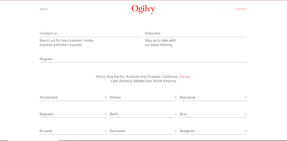
When I was thinking about advertising companies the first one that came to my mind was Oglivy. In the photos below you can see images of its website (Home page-About-Contact Page). I really like the Home Page, because it shows the work which was made by this company. All images on the Home Page are clickable and they present examples of Oglivy company's work. Speaking about the page About, I would like to point out that the creators of the site have inserted the necessary information and omitted the points that could be nosy for the reader. There will be a brief historical description of the company, then if you go down, there will be portraits of employees. It is an extremely useful feature because employers can see with who they will work. The page About is divided into four different categories: Oglivy, Team, Ideas, and Careers. Each category contains a lot of useful information for employers. The last page is the Contact page. This web page is made minimalist and simple. Even the person who minimally uses the Internet, will understand how to contact the company. One of the features of this page is that all addresses, phone numbers, and e-mails are listed at the bottom, depending on the country.
BBDO
The second website I would want to share with you as an example is the website of another advertising company named BBDO. Speaking of the Home Page, I would like to point out that on the screensaver stands the main and the latest news that this company has received an award. As for me, it is a good step to let employers know that it is a really nice company. If you scroll down, you will see clickable pictures. This is very convenient, as the employer can immediately see the company's work. Describing the About Yourself page, the first thing the reader sees are a couple of suggestions about how the company began to exist and then a list of awards that the same photo won. Most of all on this site, I did not like the page Contact. The thing is, it takes a person a while to figure out how to find this page, because there is no inscription for it. To find this page you need to click on the icon to the right of the Linkedin icon. Also, this company does not have the option to contact and leave feedback directly through the site. In order to write to them, the reader and potential employer need to write them directly by e-mail or come to their office. And in order to directly find their address and mail, you need to flip down to the end of the page.
Comparing
Comparing these two advertising companies helps me to understand how to create my site in order for a potential employer to be interested in my personality as a professional. Ogilvy’s and BBDO’s Home pages are quite similar in that both show examples of their work. I would like to make a similar thing and add examples of my works to my Home page. The two companies have quite different pages about themselves and contain different information. BBDO does not have any information about the employees, and their couple of proposals for the establishment of the company did not seem to me sufficiently informative. In comparison to the pages About I give my preference to Oglivy. The last page for comparison is the Contact page. Speaking of these two pages, I am absolutely sure that the Contact page of Oglivy is much better than the BBDO, because it is easy to use. Oglivy can be contacted directly by the employer. The contact page of Oglivi is an example of the perfect page for me. I will use it as an example to create my own.
To sum up, I can say with confidence that the Oglivy's website was much more informative and convenient for me than the BBDO website. Therefore, I will use it as a reference during creating my site.


,_Amerikaans_rec,_Bestanddeelnr_922-5100.jpg)

Comments
Post a Comment